
Terra Dulce
Terra Dulce is a brand identity for an artisan alfajor offering. The system combines a warm, traditional presence with assets designed to identify flavours, support packaging, and make every delivery recognisably part of the same brand.
Project
An artisan identity designed to spark appetite and stay memorable
Terra Dulce was developed as an artisan alfajor brand with an identity capable of conveying craft, warmth, and a recognisable flavour proposition from the first glance.
The system starts with a classically inspired logo: expressive lettering, an ornamental frame, and a palette of browns, cream, and gold. Together, they create a considered artisan feel while retaining impact at small sizes.
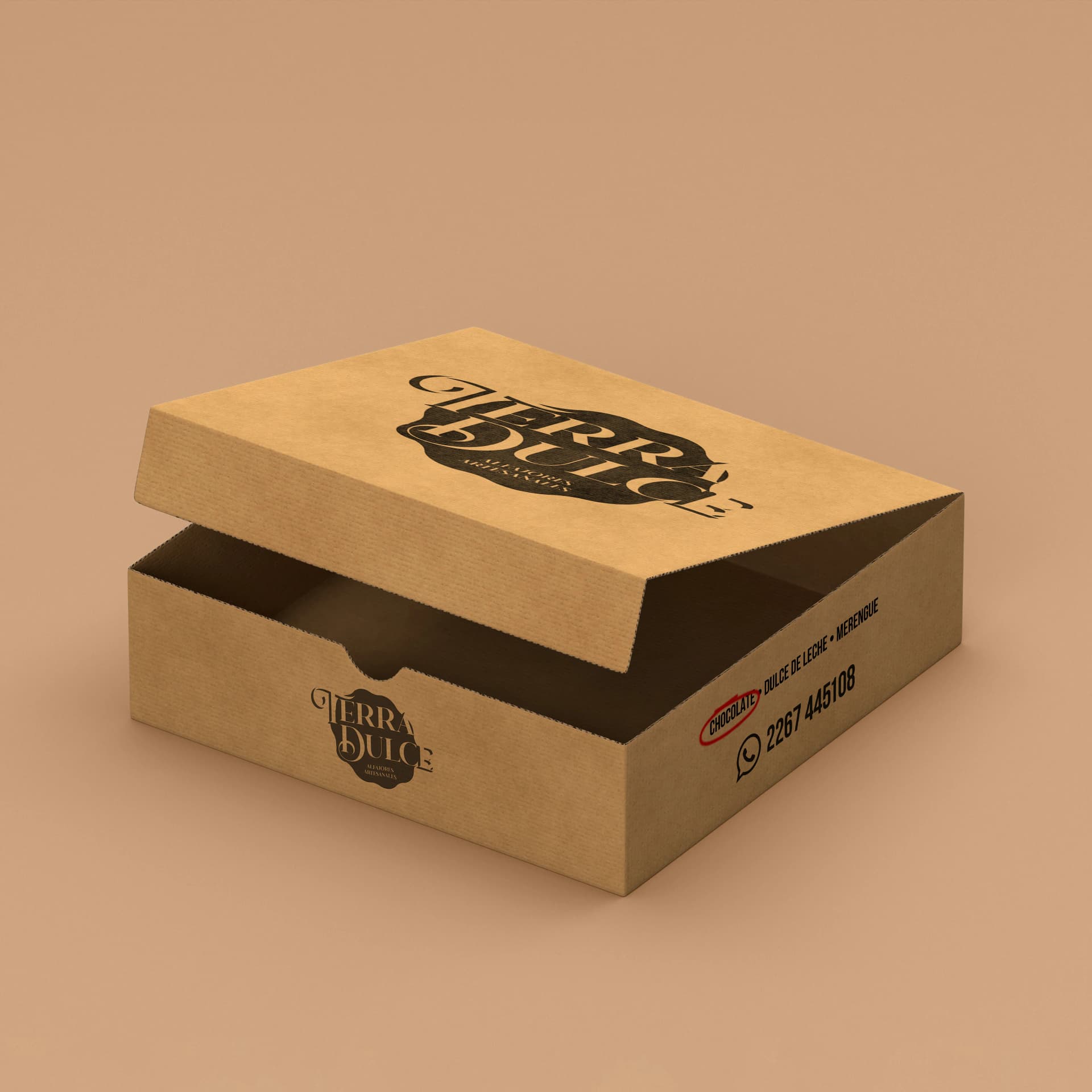
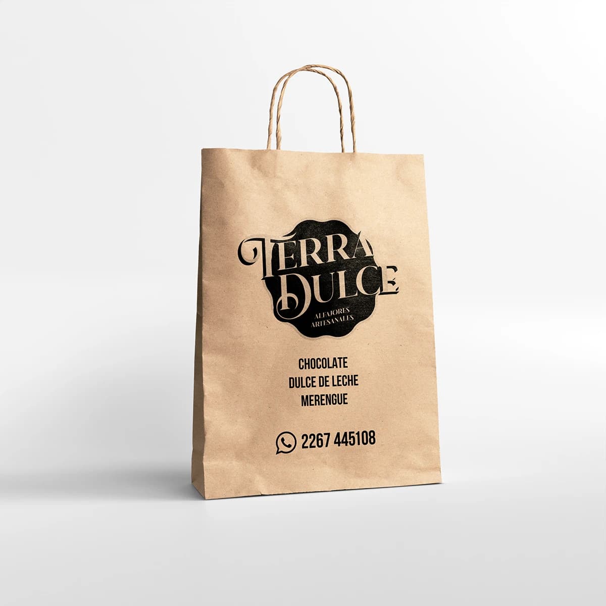
The identity was applied to flavour labels, paper bags, and packaging pieces. Every touchpoint keeps the same personality, so the product feels coherent both on display and when taken home.
Problem & solution
An artisan offering needed a distinctive presence in a highly visual market
A warm, distinctive system ready for labels, packaging, and delivery
Project images
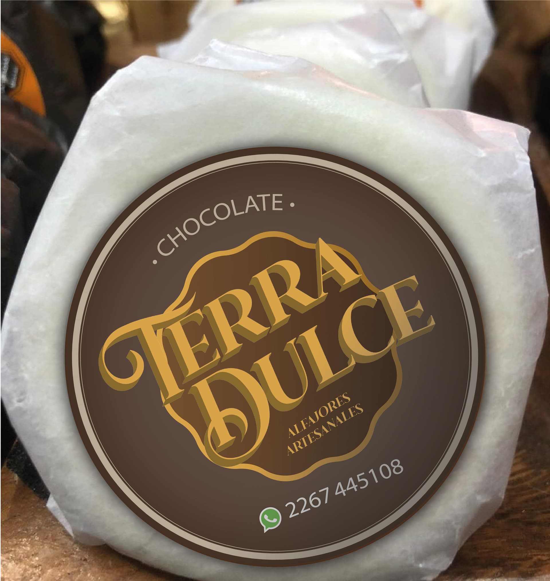
From an artisan recipe to an identity that supports every flavour
Defining the personality
We built a warm, artisan, approachable brand direction aligned with the world of carefully made alfajores.
Logo design
We developed a primary mark with lettering, ornaments, and a composition designed to work equally well on a label or a bag.
Flavour system
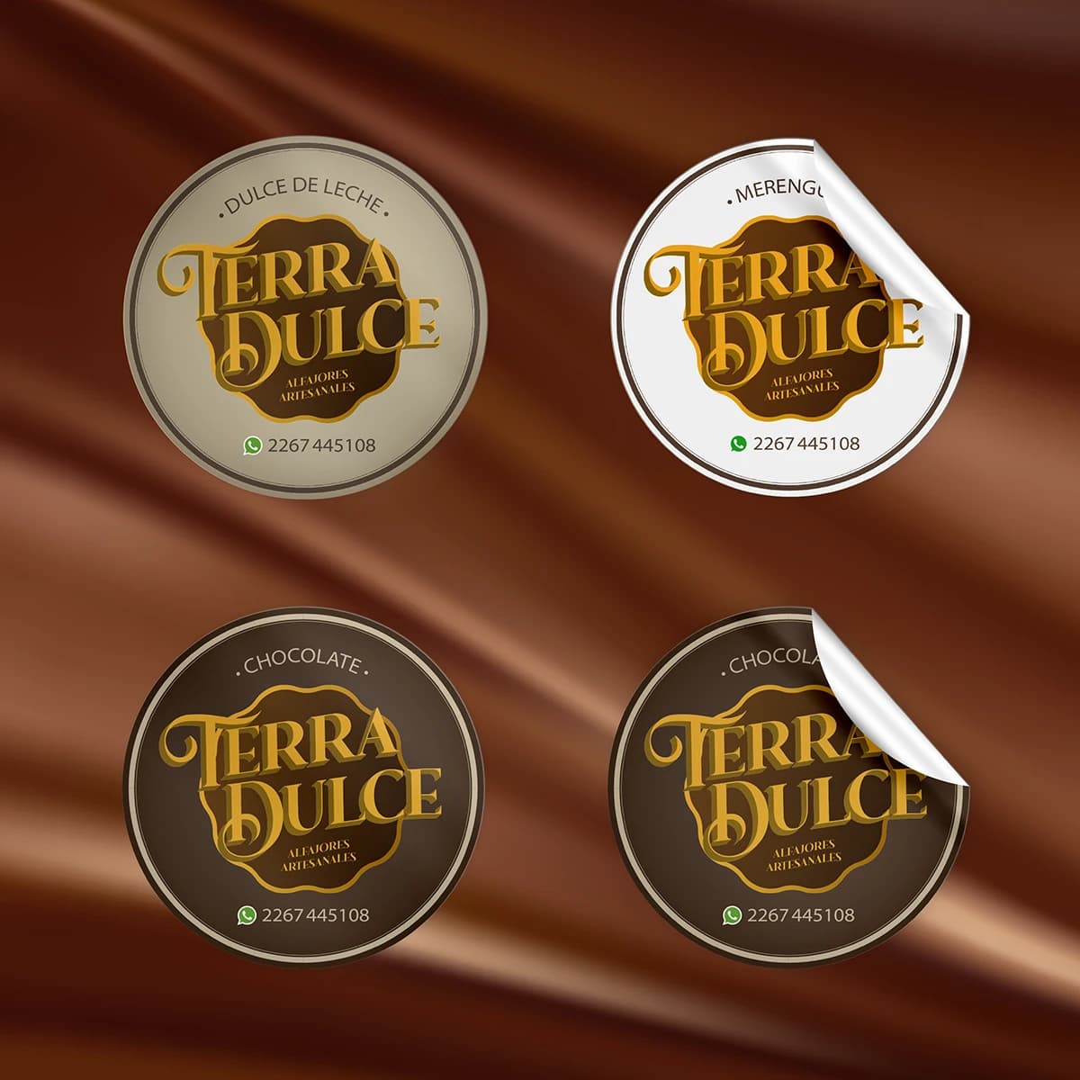
The identity was adapted to different varieties through labels that preserve the brand while differentiating each offering.
Packaging and delivery
The system extended to paper bags and presentation pieces so the buying experience maintains one coherent visual voice.