
SuperFIT
SuperFIT is a brand identity for a women-focused personal training practice. The system combines an energetic, approachable presence with assets for classes, digital communication, working materials, and apparel.
Project
An energetic identity for training and community
SuperFIT was created as the identity for a women-focused personal training practice. The goal was to build an easy-to-recognize brand, energetic enough to motivate and approachable enough to support its community.
The system begins with an expressive logo: a moving silhouette integrated with a barbell accompanies a wordmark that combines strength and flow. The contrast between deep burgundy, violet, and white keeps the identity impactful while remaining clear.
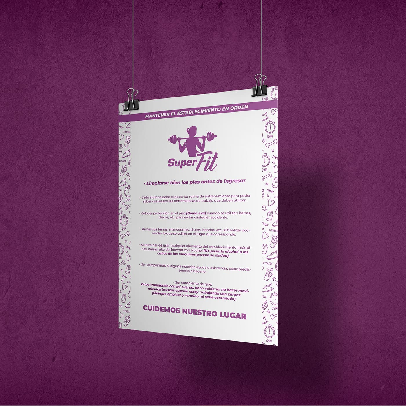
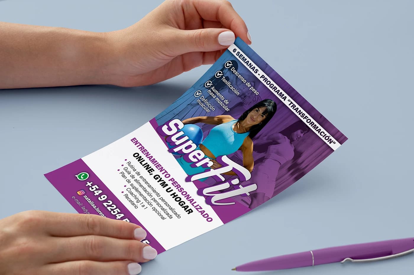
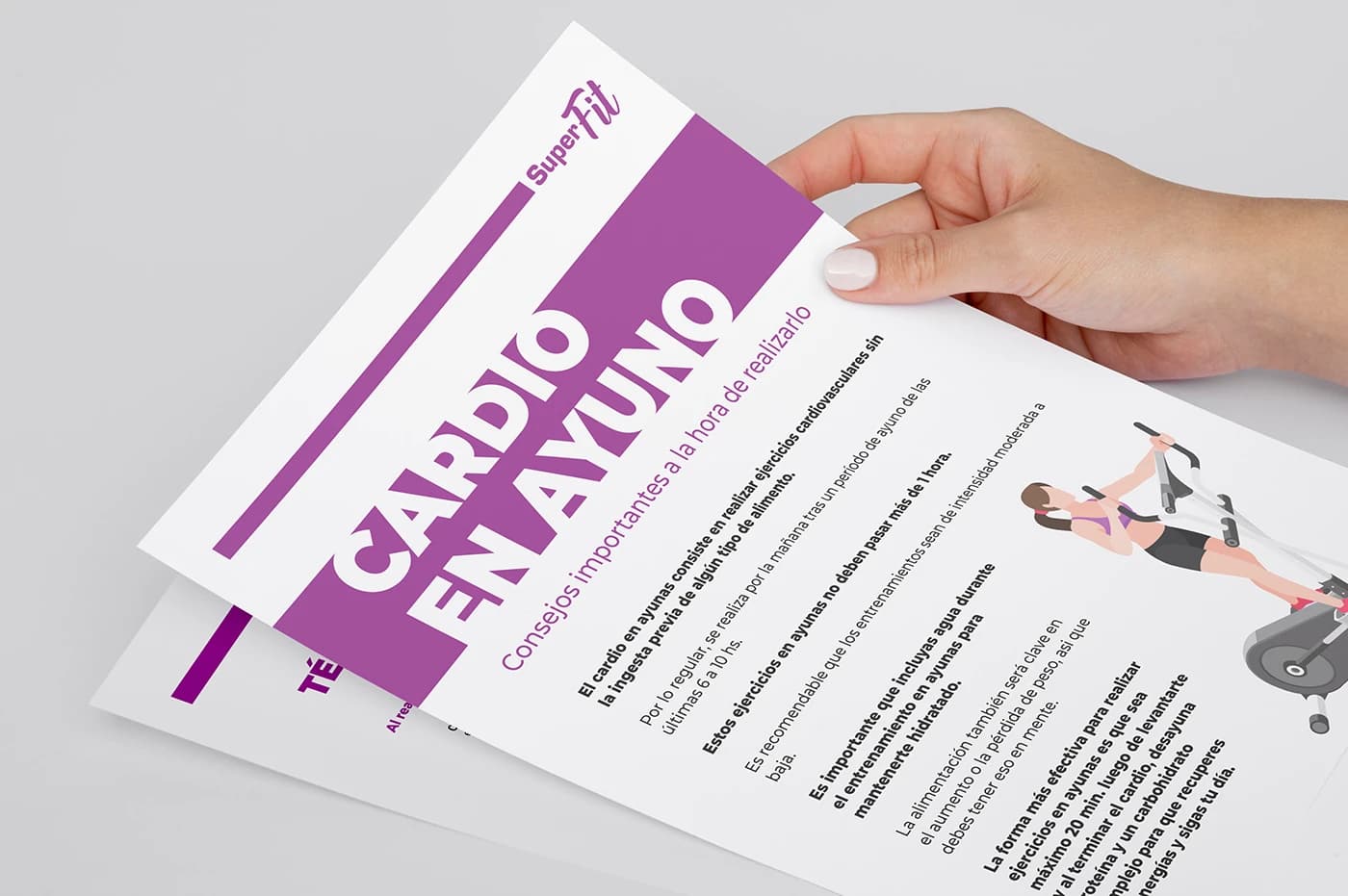
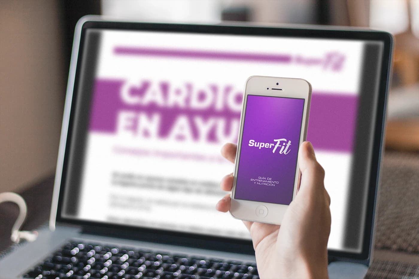
Beyond the logo, a flexible language was developed for social media, training and nutrition guides, credentials, signage, apparel, and communication pieces. Each application keeps the same visual voice so the brand can be recognized inside and outside the training space.
Problem & solution
A personal offering needed an ownable, recognizable identity
An expressive, adaptable visual system ready for everyday use
Project images

From training concept to an applicable brand system
Brand concept definition
We identified an energetic, approachable personality centered on progress, using women-focused personal training as the starting point for the visual language.
Building the main mark
We designed a logo that combines a silhouette lifting a barbell with a typographic pairing that feels athletic and expressive.
Color system and assets
We established a burgundy, violet, and white palette, together with patterns and iconography that could extend the identity recognizably.
Community applications
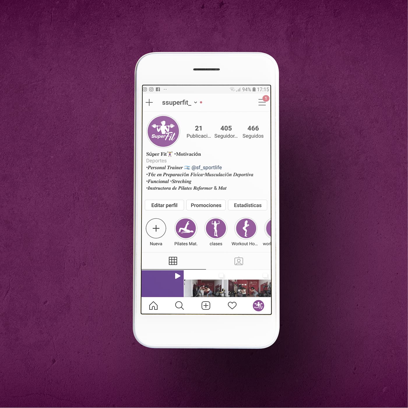
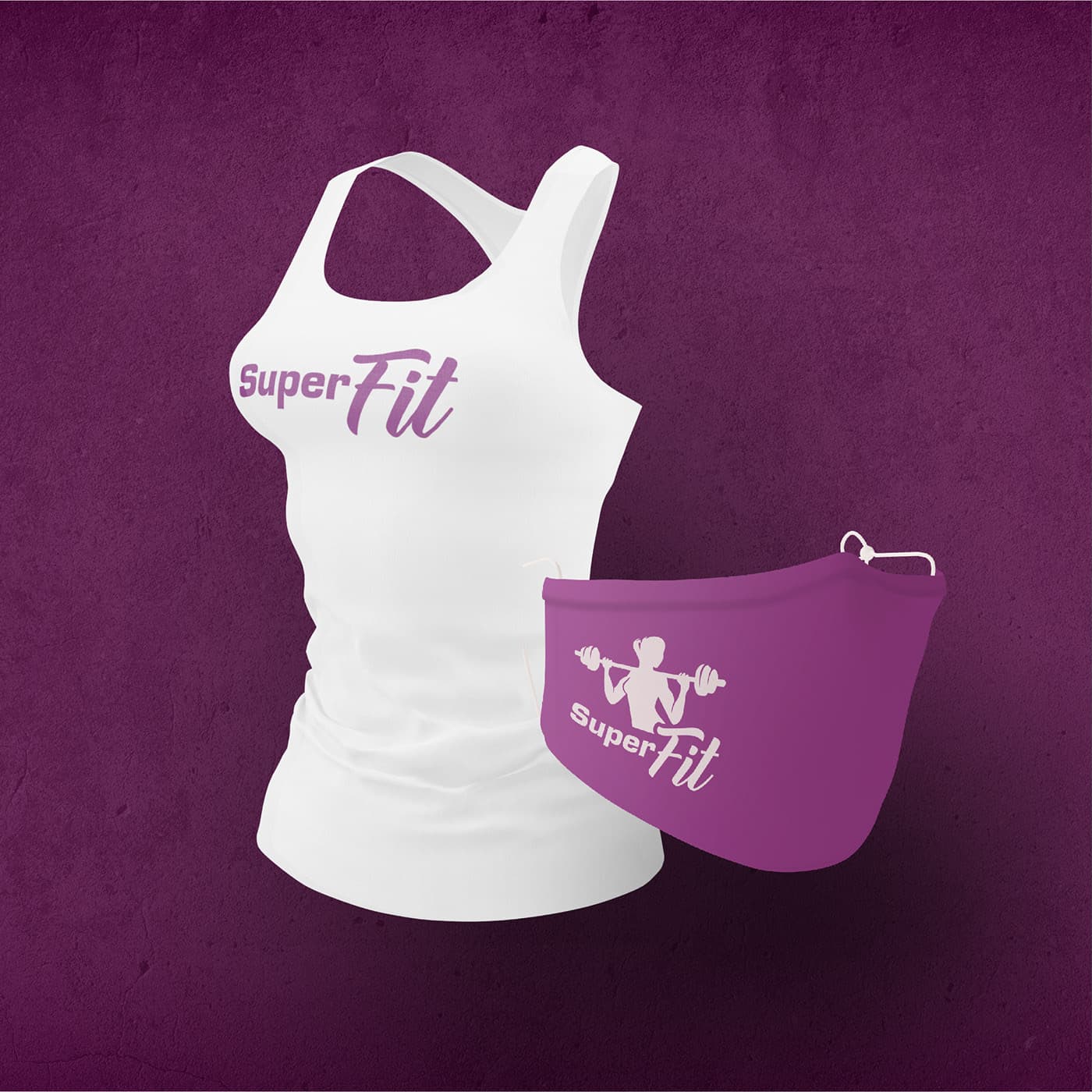
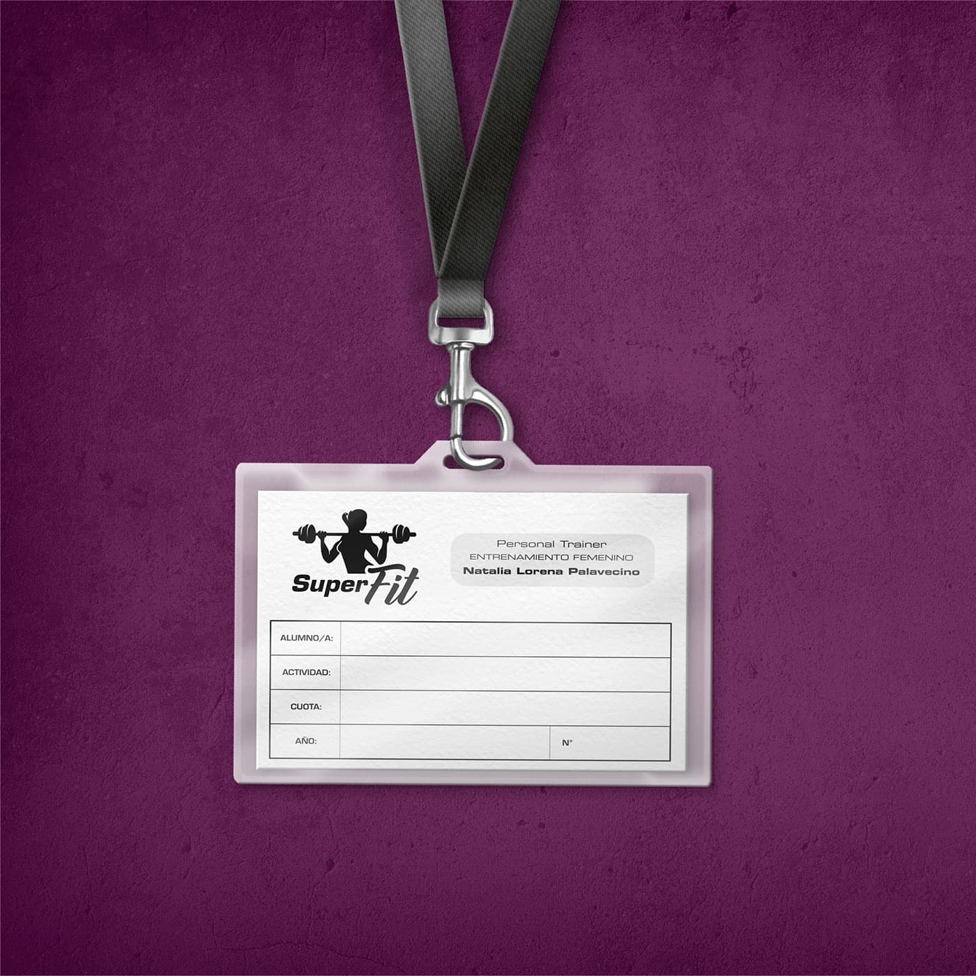
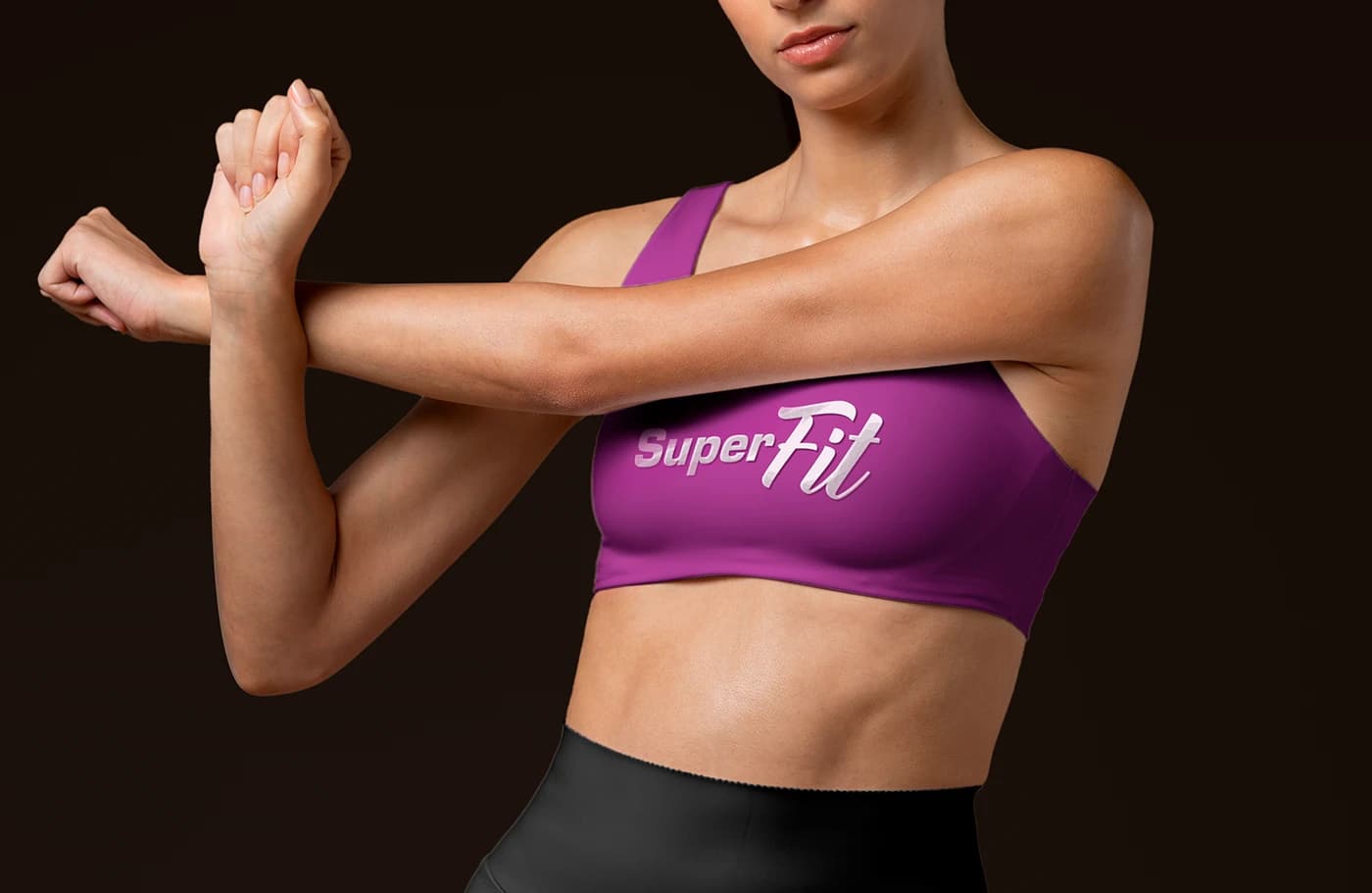
The brand was applied to social profiles, credentials, signage, and apparel to support classes and the day-to-day relationship with the community.
Content materials
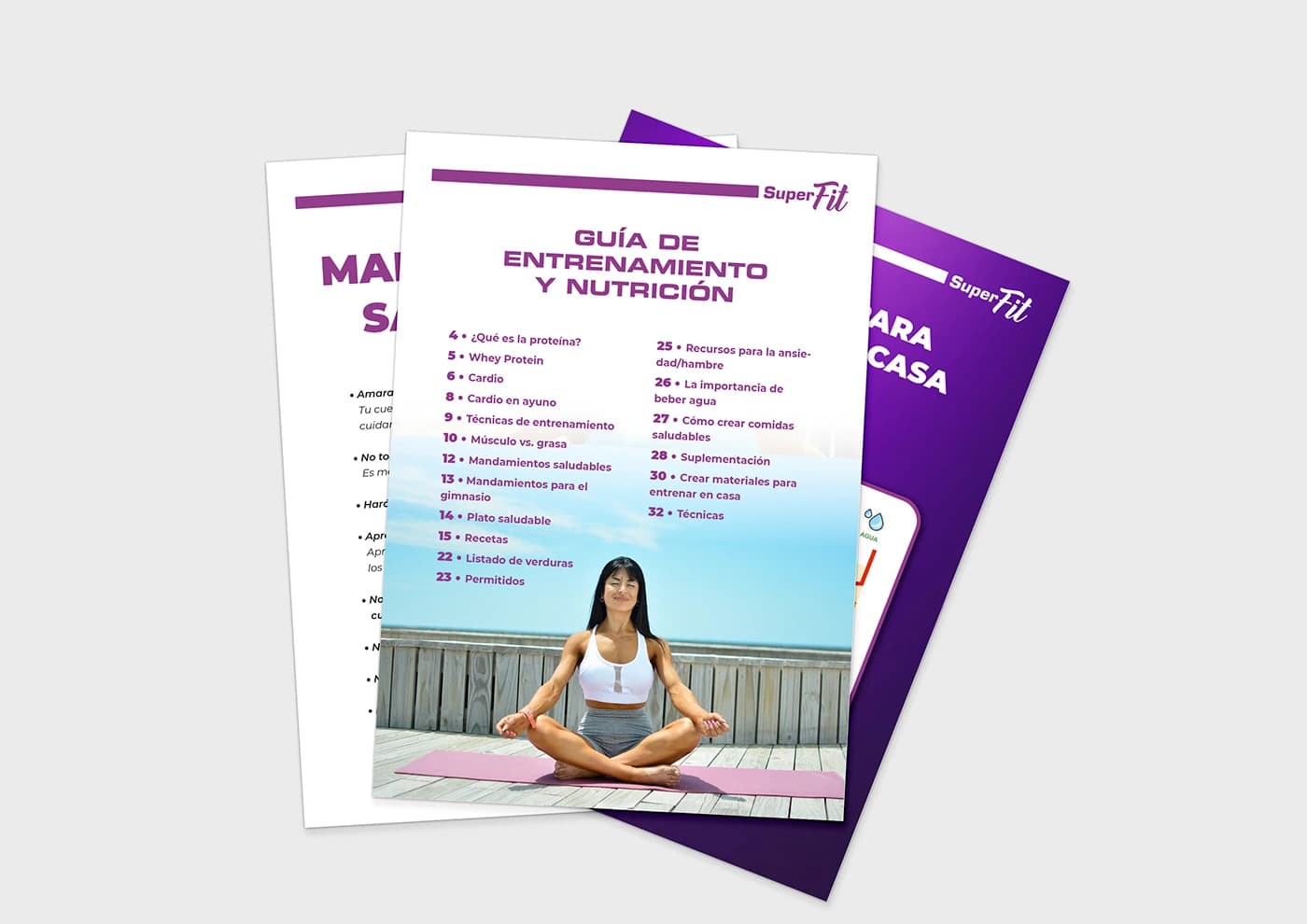
We designed guides and informative pieces so training and nutrition could be communicated in one visual voice.