

Beats
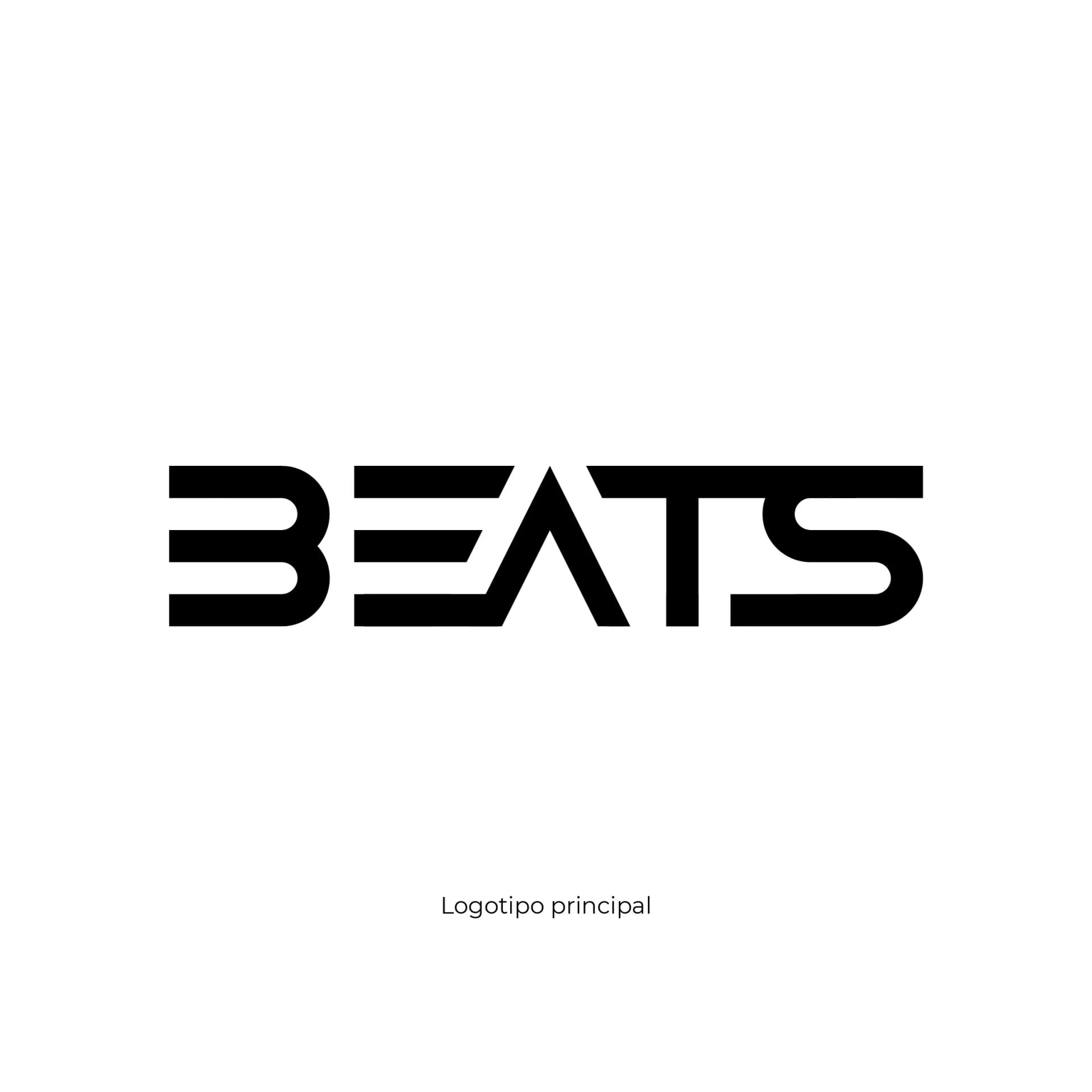
Beats is a visual identity for a DJ music production company. The project starts with a high-impact typographic mark designed to move naturally between the energy of electronic music, event communication, and the different touchpoints of a contemporary production company.
Project
A dynamic, memorable identity for an electronic music production company
Beats was developed as an identity for a music production company connected to the world of DJs and electronic music. The goal was to create a direct, memorable brand able to convey energy while retaining clarity in every appearance.
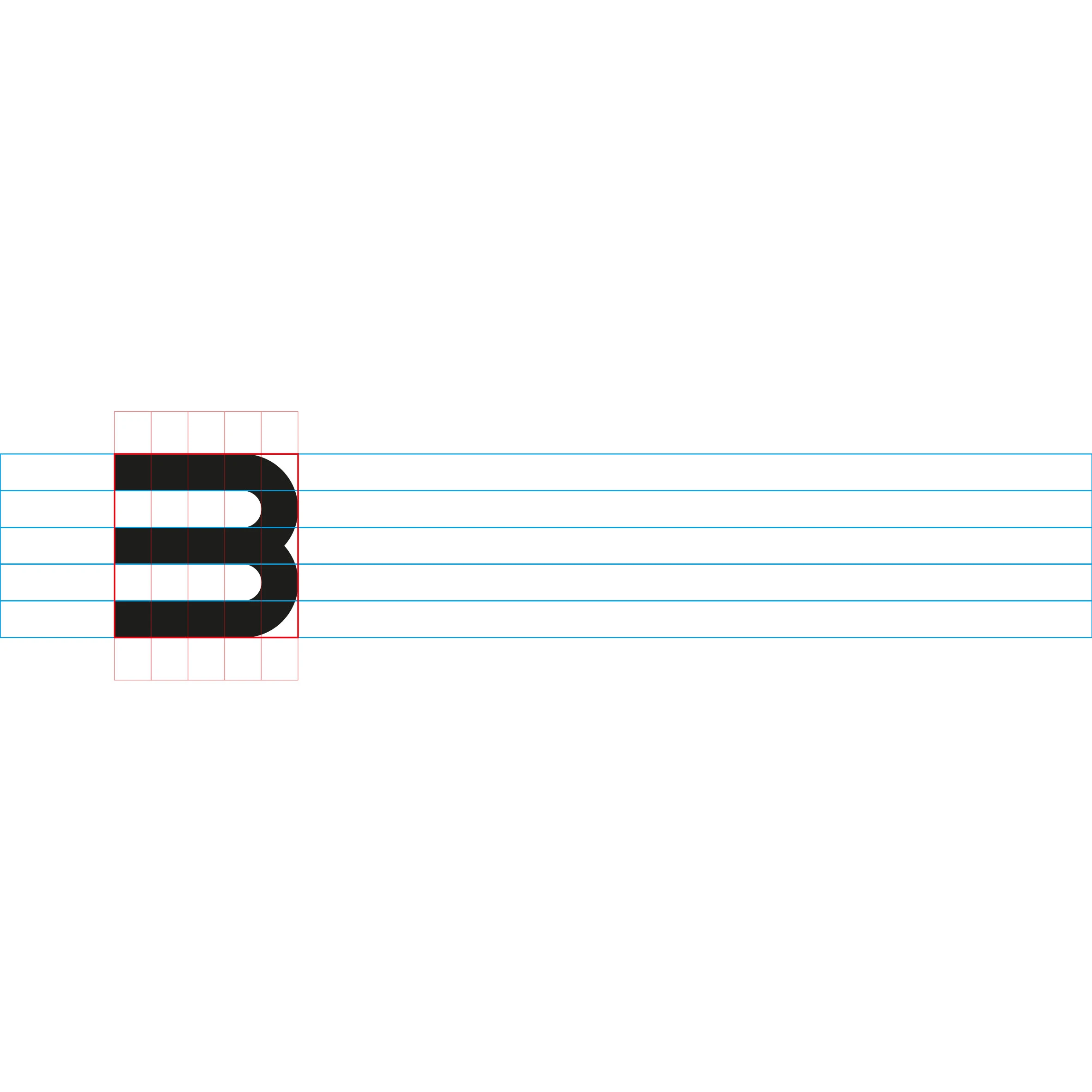
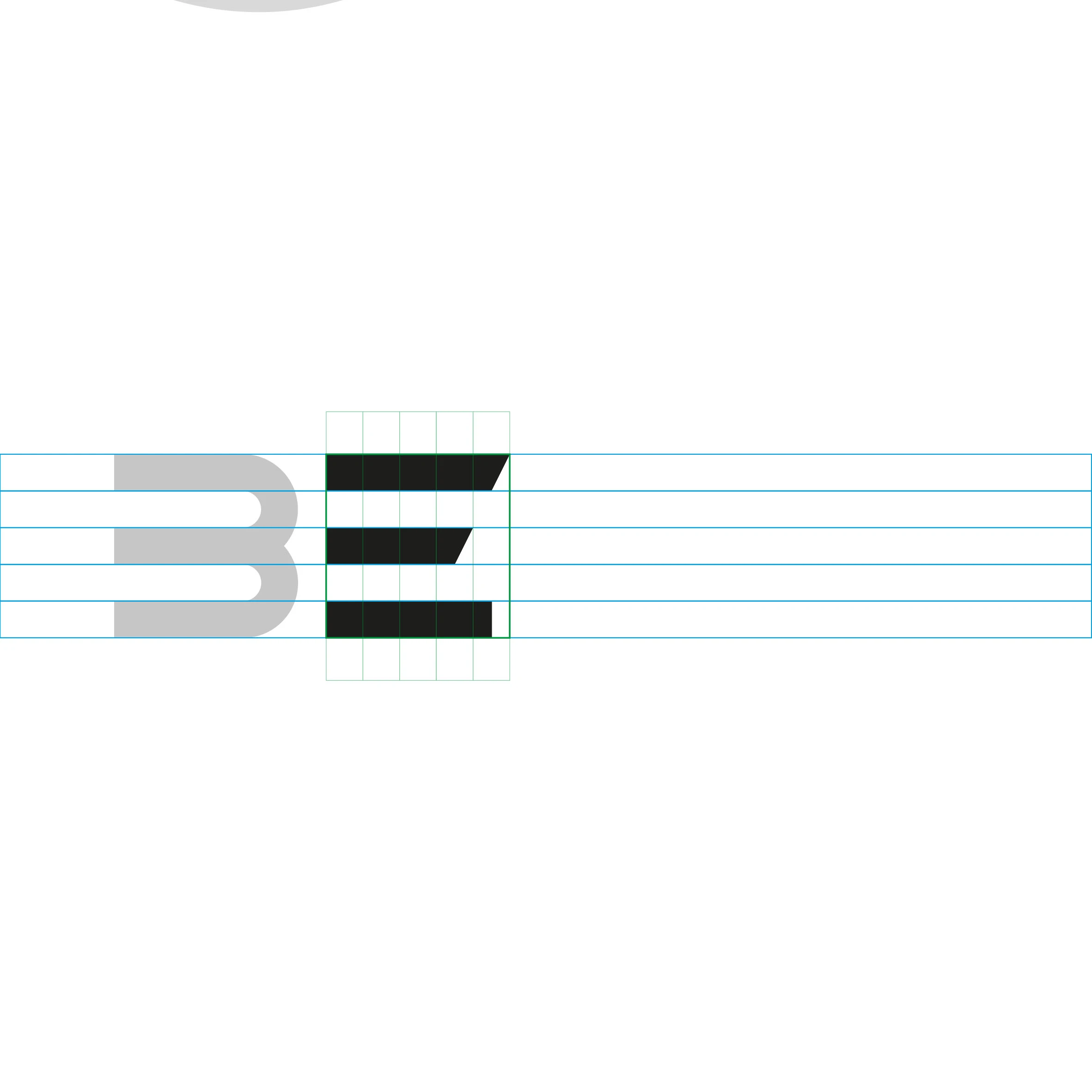
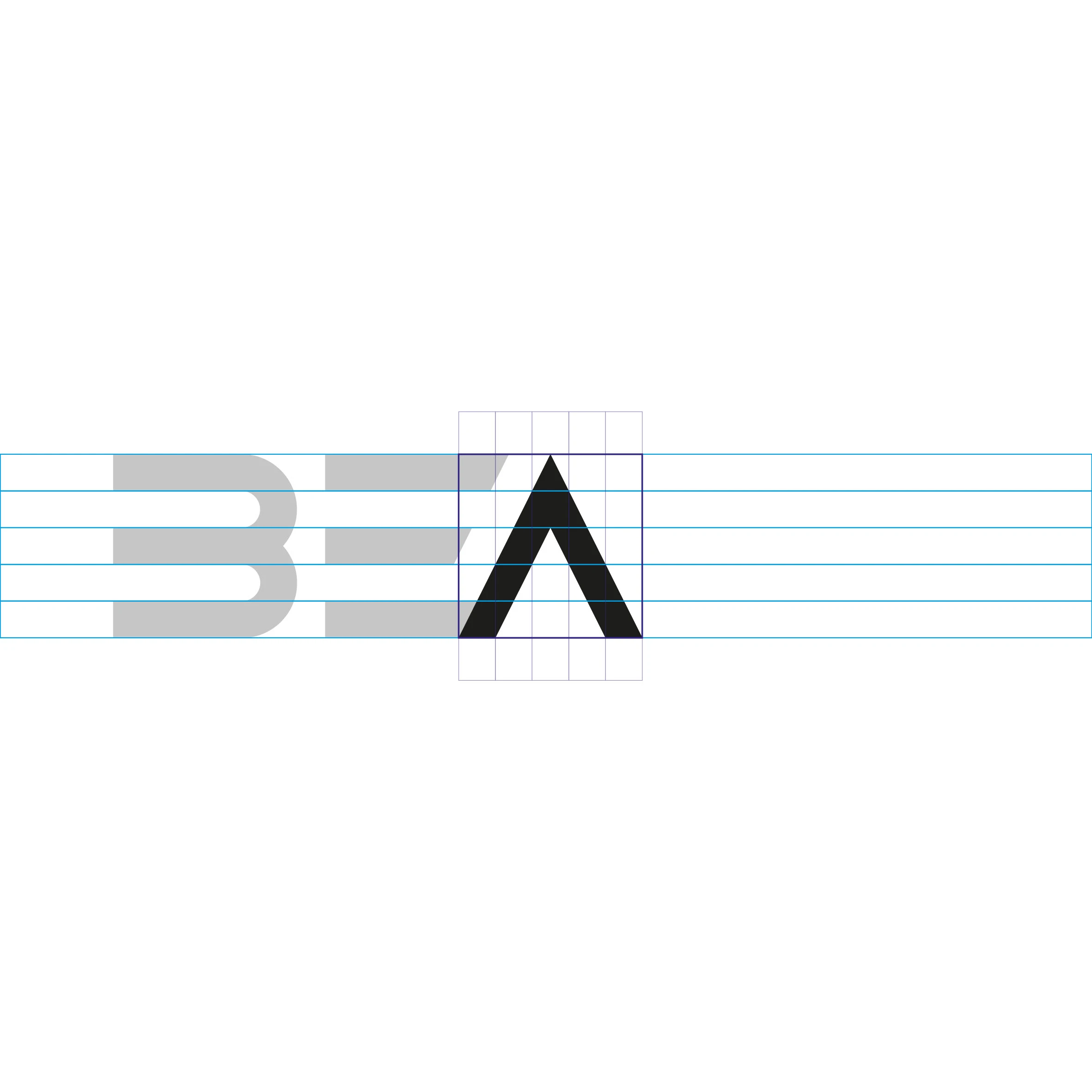
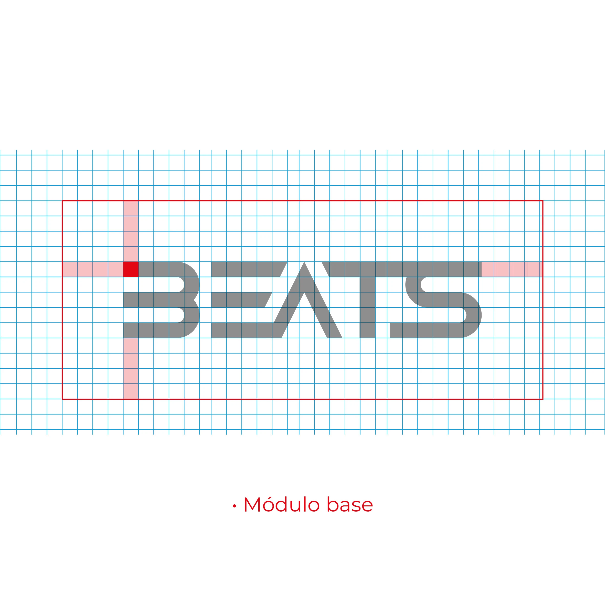
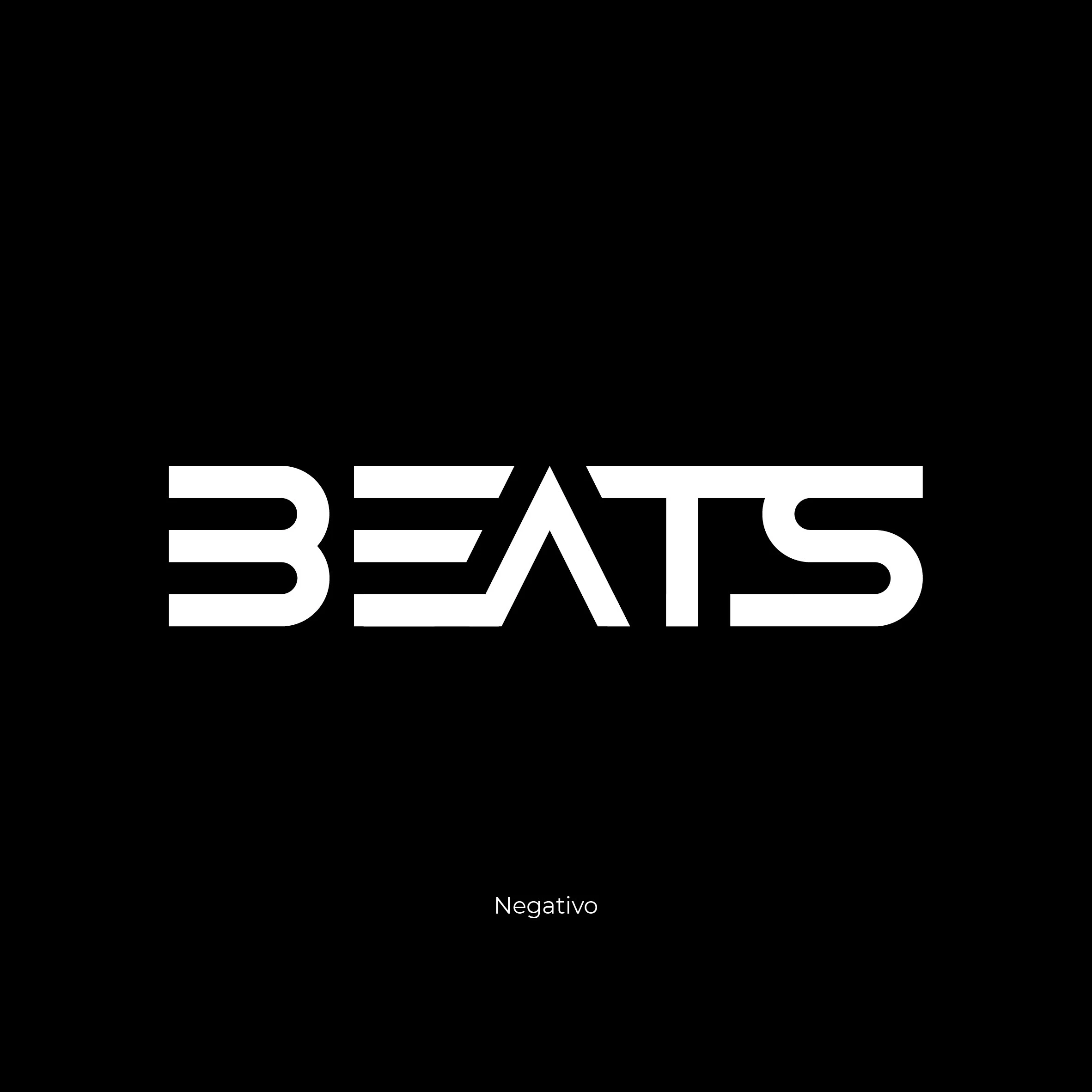
The logo is built from a geometric module that shapes the letters and creates its own rhythm through the strokes and counterforms. The result is a robust typographic mark with immediate visual presence and a personality aligned with the project’s character.
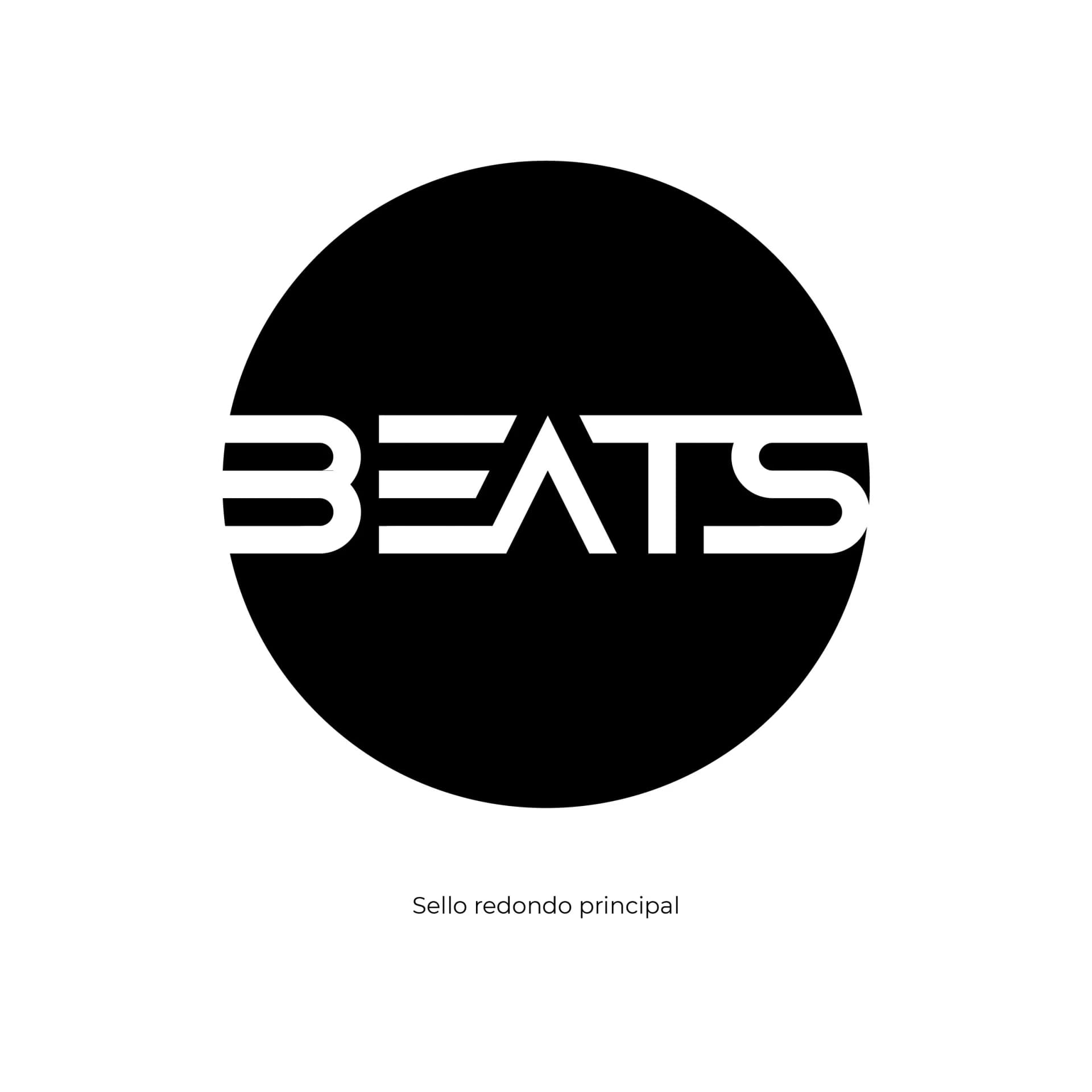
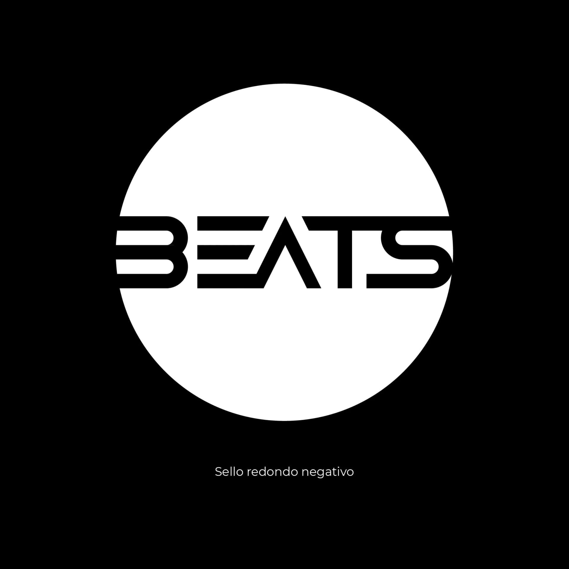
The system includes a typographic version and another within a circular seal, allowing the identity to adapt flexibly across communication, promotion, and graphic applications. Working in black and white reinforces its versatility and makes it easy to pair with high-impact visuals.
Problem & solution
A DJ production company needed a recognisable, dynamic brand that could be applied easily in changing visual contexts
A modular, high-contrast typographic system with flexible versions for different formats
Logotype creation
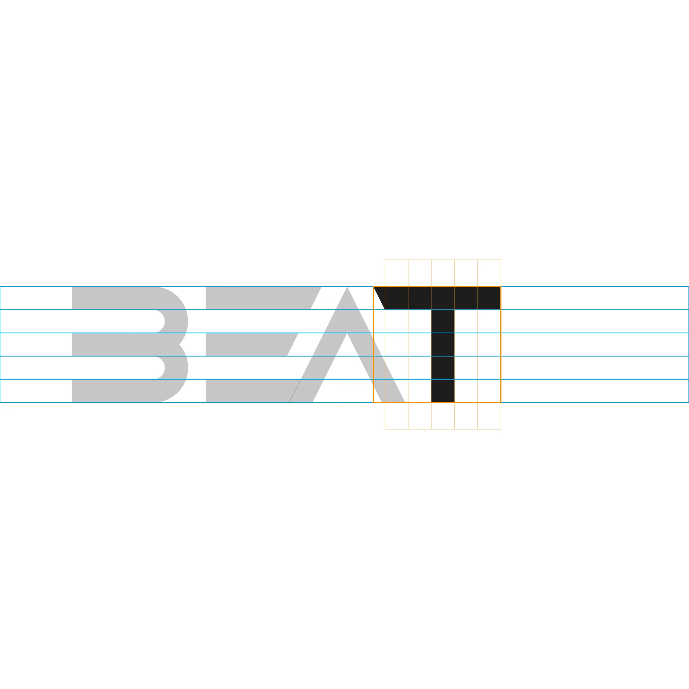
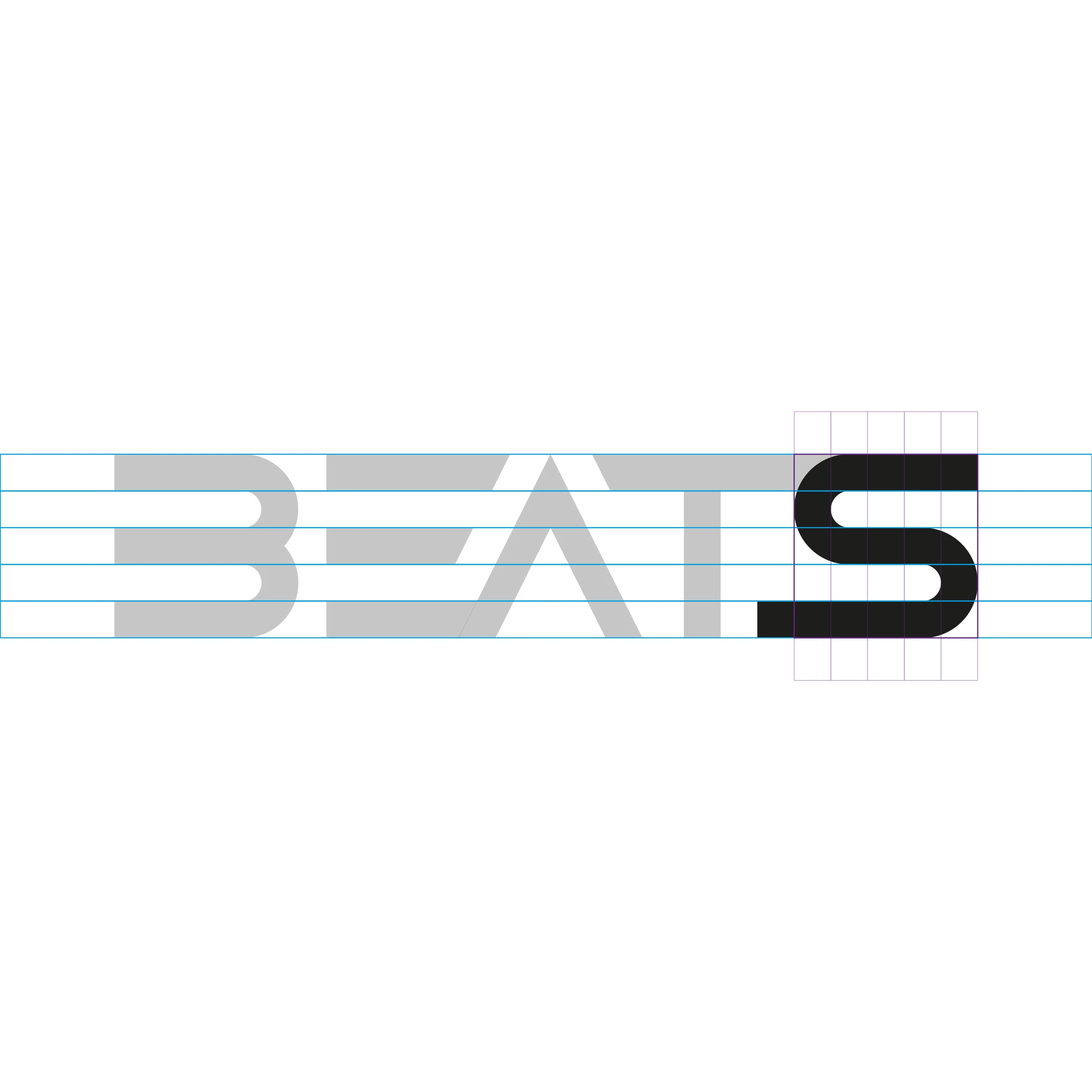
An ordered sequence tracing the construction of the mark, from the geometric module through to the final letterforms.

System foundations
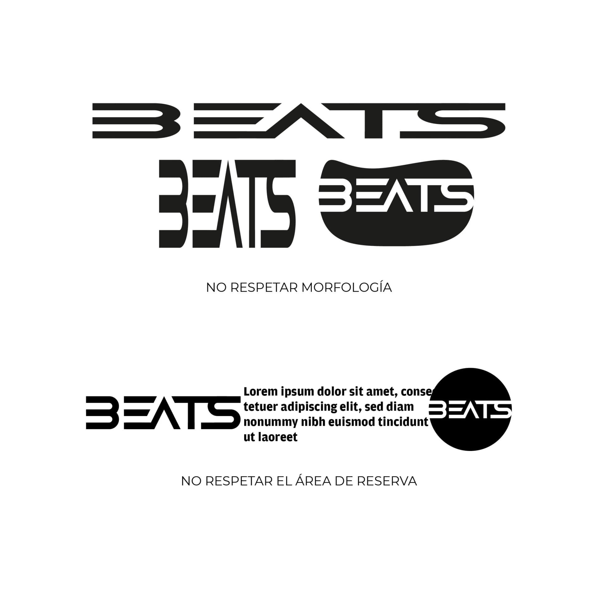
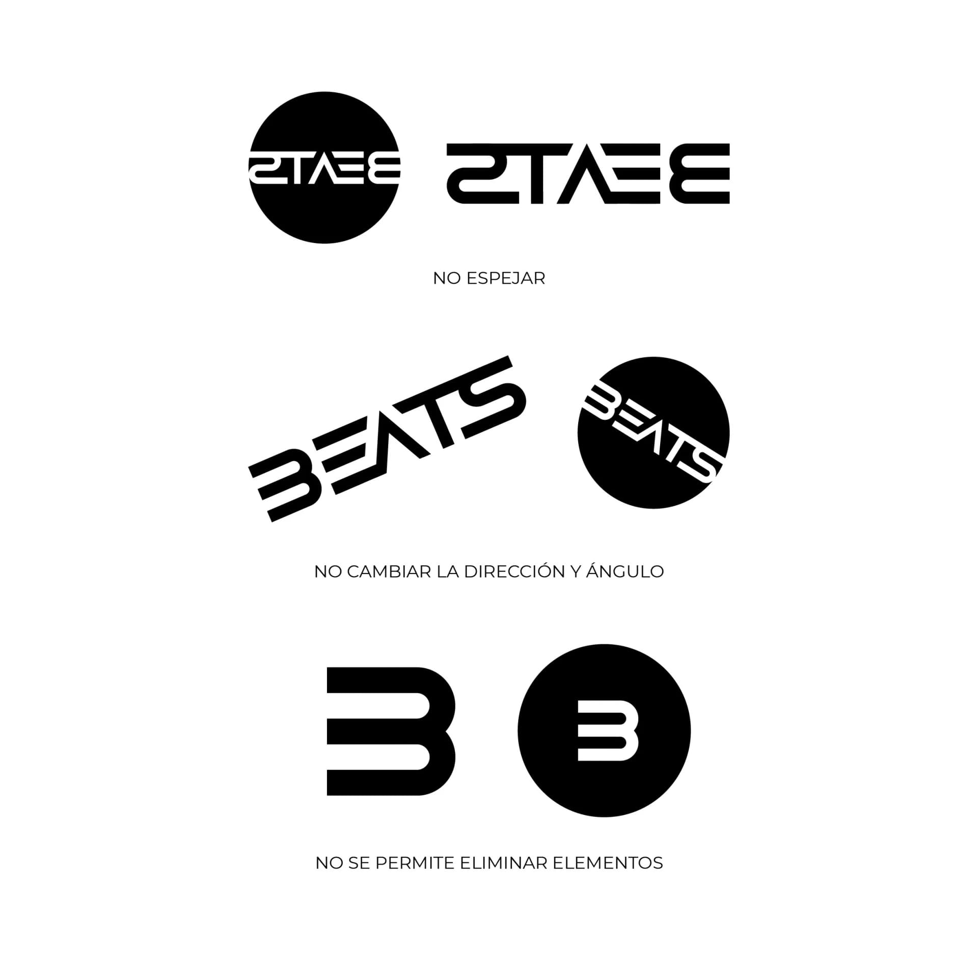
The decisions around proportion, usage versions, typography, and colour that let the identity work clearly across different contexts.
Business cards
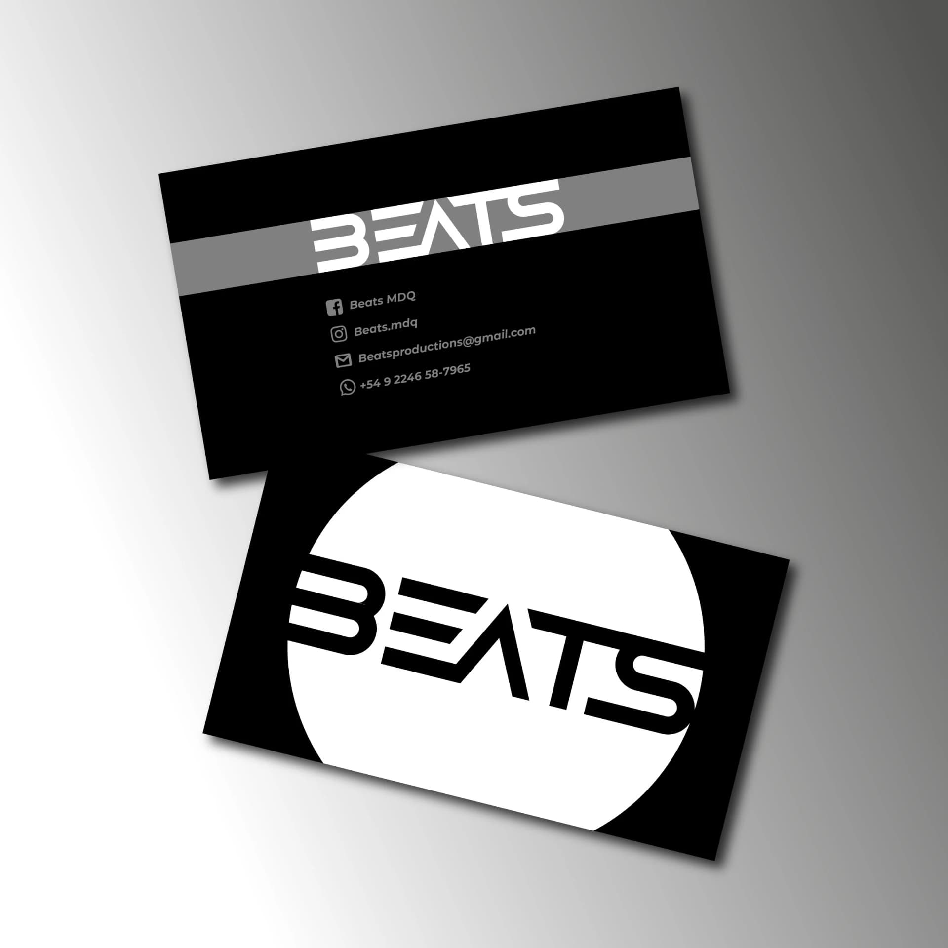
An institutional application that brings the brand system into a direct, recognisable contact piece.
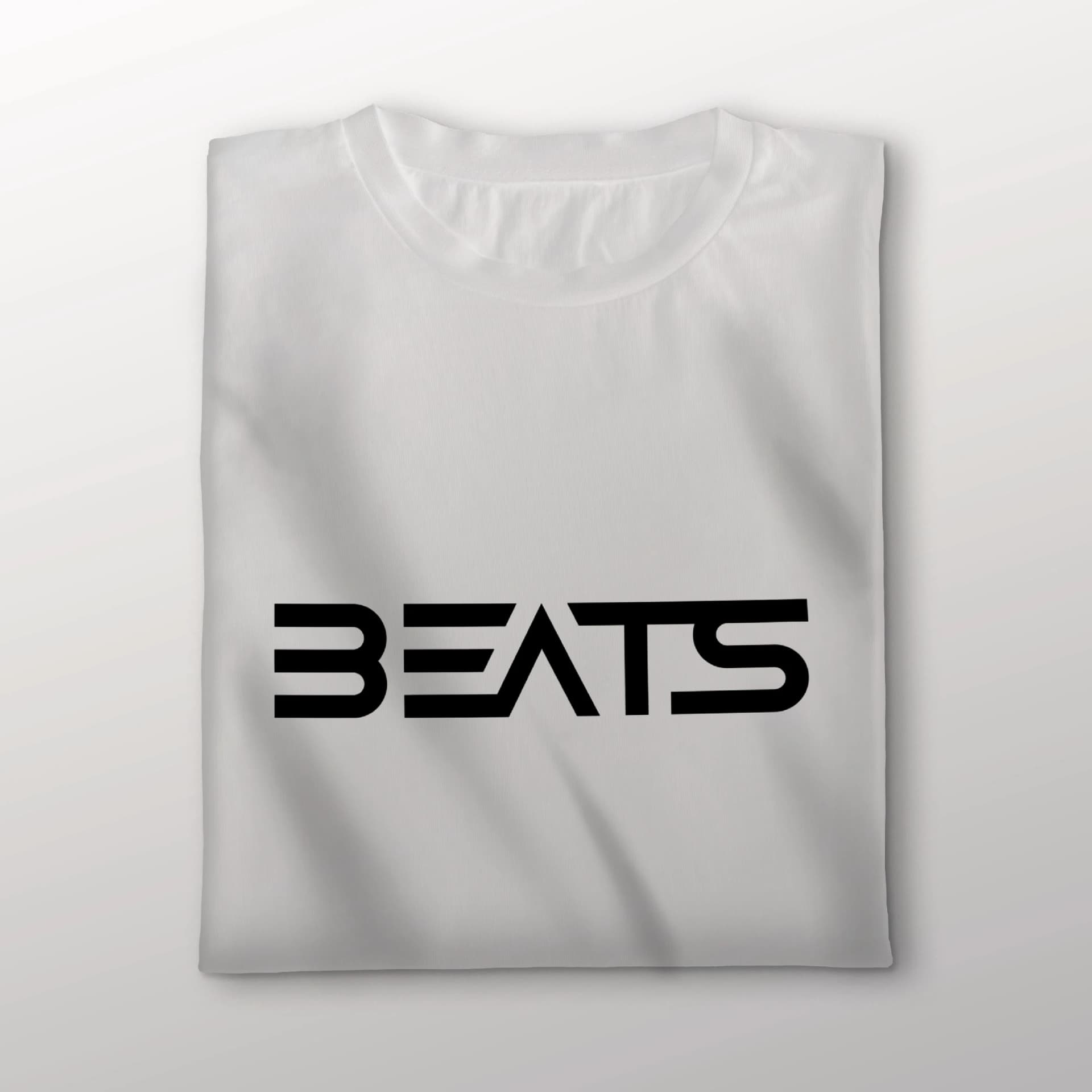
Apparel
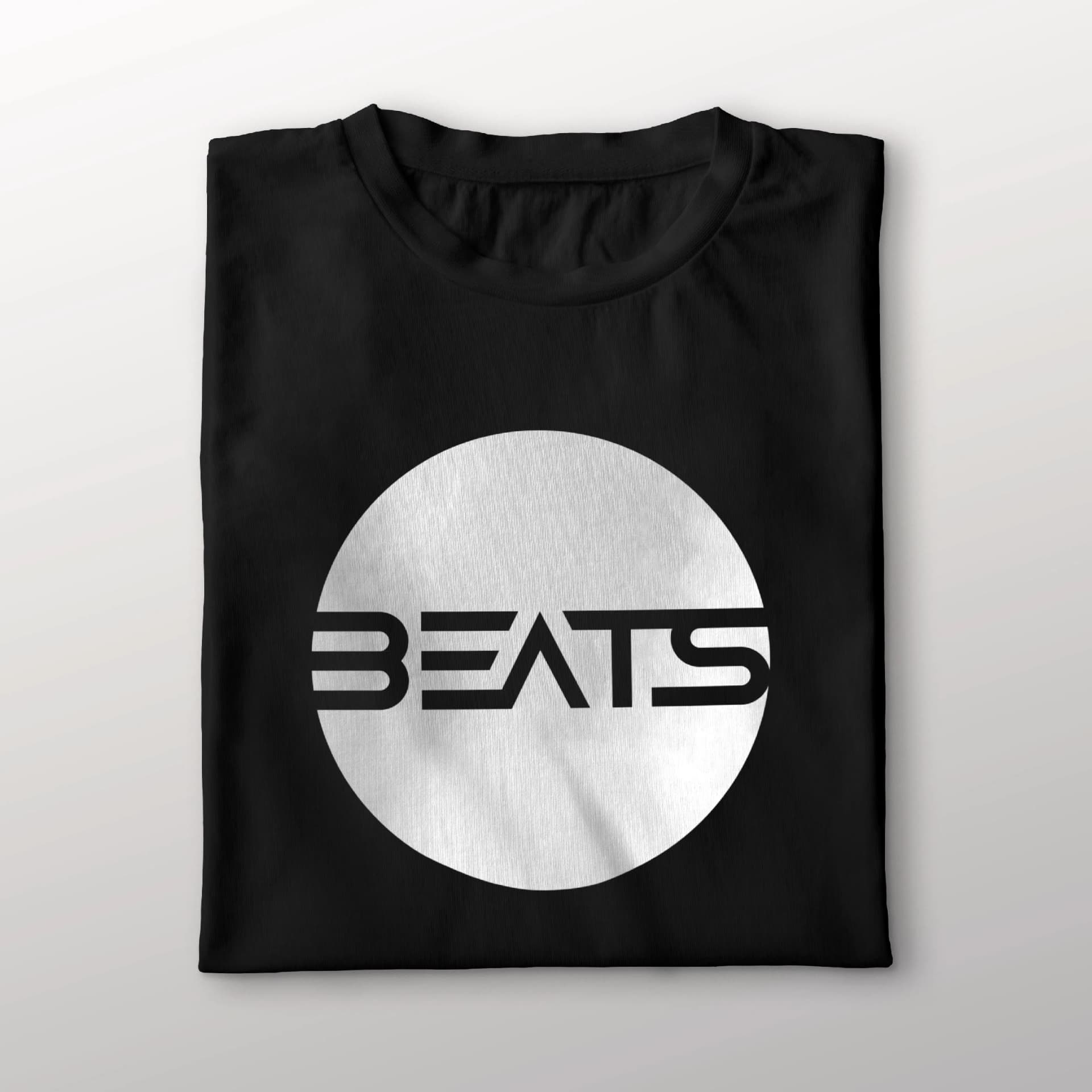
Identity applications across garments to extend Beats’ presence beyond digital communication.


From a geometric module to a brand ready to move with the music
Brand direction
We defined Beats’ core attributes: electronic music, modernity, dynamism, minimalism, and immediate visual presence.
Building the logotype
We developed a geometric module to shape each letter, giving the wordmark a distinctive rhythm and a recognisable structure.
Version system
The identity was resolved in a typographic version and another inside a circular seal to respond to different contexts of use.
Versatile palette
We defined a black-and-white usage so the mark preserves contrast, readability, and flexibility alongside different visual pieces.