

Diana Caceda & Asoc.
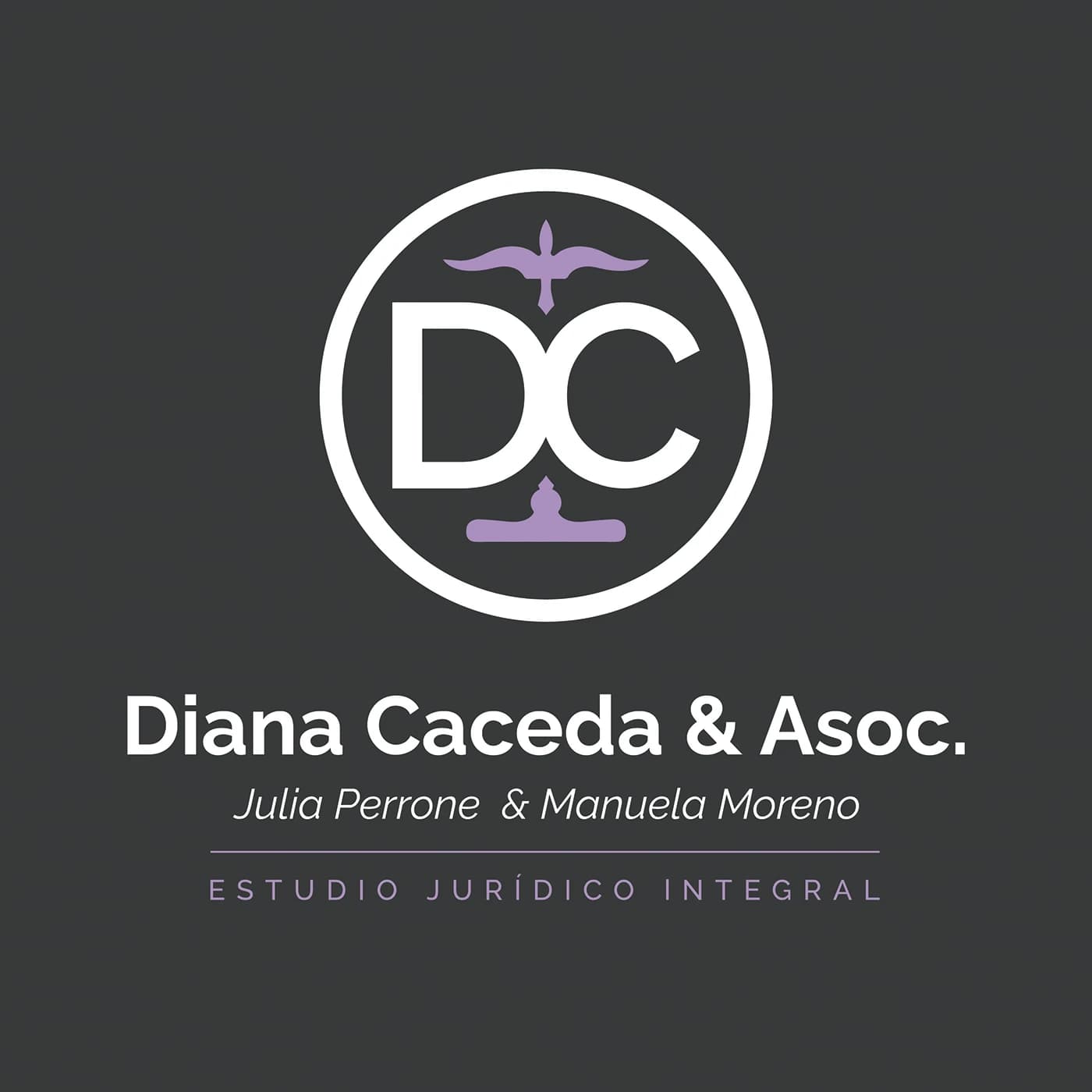
Diana Caceda & Asoc. is a corporate identity for an integrated law firm. The system balances professional solidity and approachability through a clear, recognisable brand built to support the team’s everyday communication.
Project
A corporate identity that communicates trust, clarity, and team unity
Diana Caceda & Asoc. was developed as an identity for an integrated law firm. The goal was to create a consistent, professional visual presence that supports client relationships from the first contact through institutional documentation.
The system is organised around a DC monogram and an ornamental element that gives the brand a distinctive signature. A combination of charcoal, white, and soft violet communicates gravity without relying on rigid or impersonal visual codes.
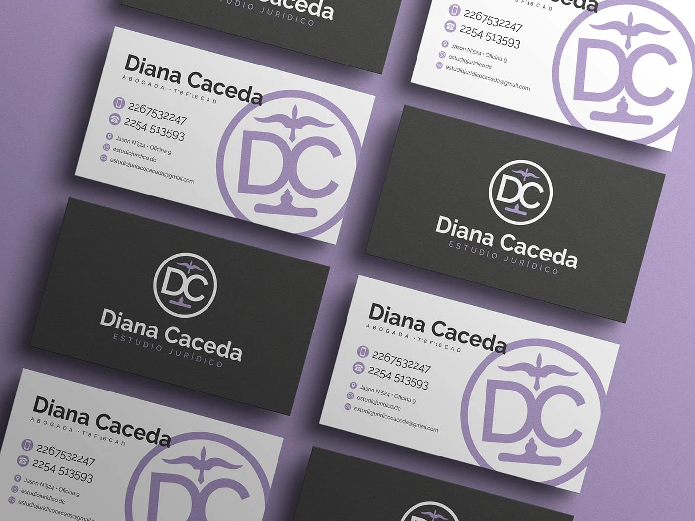
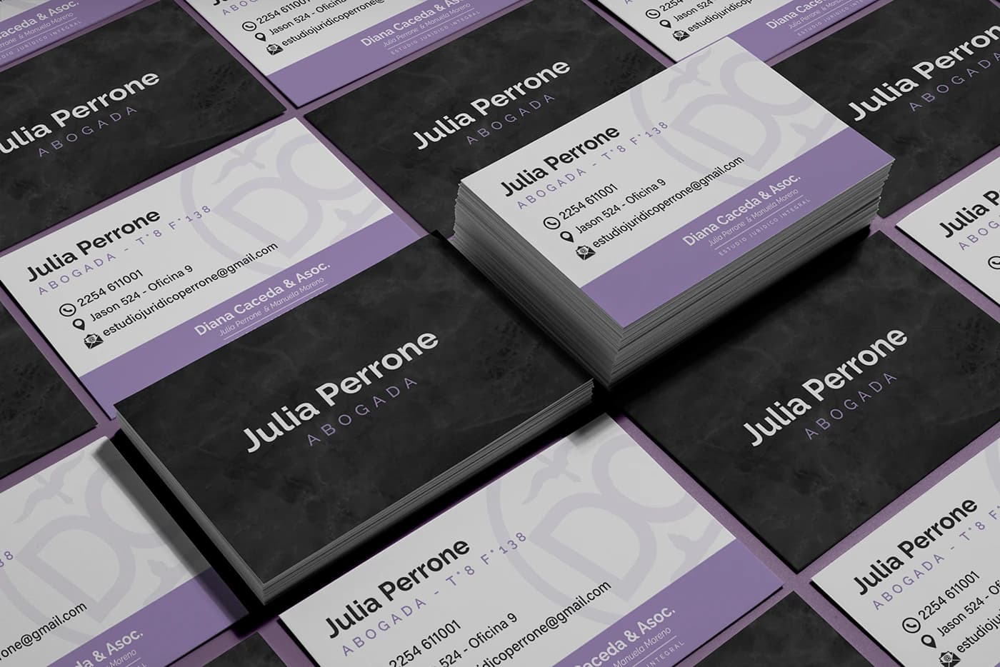
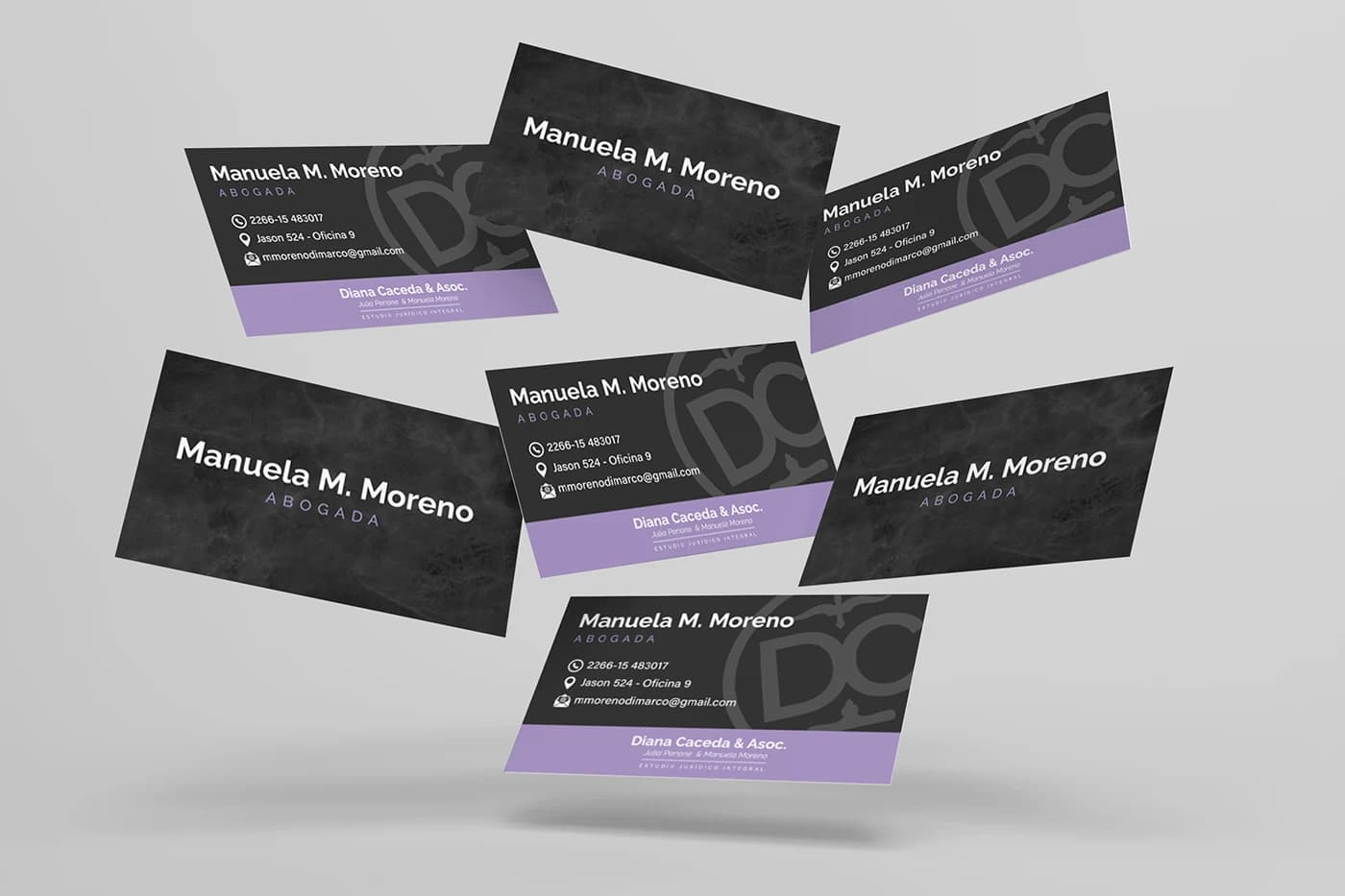
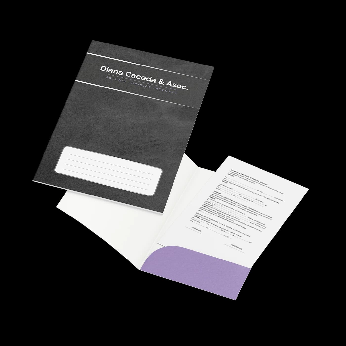
The identity extended to individual cards for each team member, institutional versions, graphic applications, and a corporate folder. As a result, each piece carries one visual voice and reinforces the firm’s unity across its touchpoints.
Problem & solution
A law firm needed a shared identity to organise its institutional presence
A sober, flexible visual system ready to represent the team across every format
Project images

From a central identity to a corporate system for the whole firm
Institutional direction
We defined a brand personality that combines clarity, trust, and a professional presence aligned with legal practice.
Building the monogram
We designed a central mark from the DC initials and an ornamental motif that gives the identity recognition and character.
System for the team
The identity was adapted to individual business cards so every professional could introduce themselves while retaining belonging to the firm.
Corporate stationery
The system extended to institutional versions and a corporate folder for documentation and formal meetings.